
*This is a collaborative post.
Colour does more than add personality, it shapes the entire feel of your space. The right combination can set the mood, enhance natural light, and make a room more spacious. Understanding colour theory and the best colour combinations for a harmonious home aesthetic can make decorating much more rewarding.
Your home should be a reflection of your style while also providing a sense of comfort and cohesion. From your home flooring and walls to furniture and decor, thoughtful colour choices help bring every space together beautifully. Let’s explore how different colour palettes can transform your home while maintaining balance and warmth.
Earthy and neutral palettes
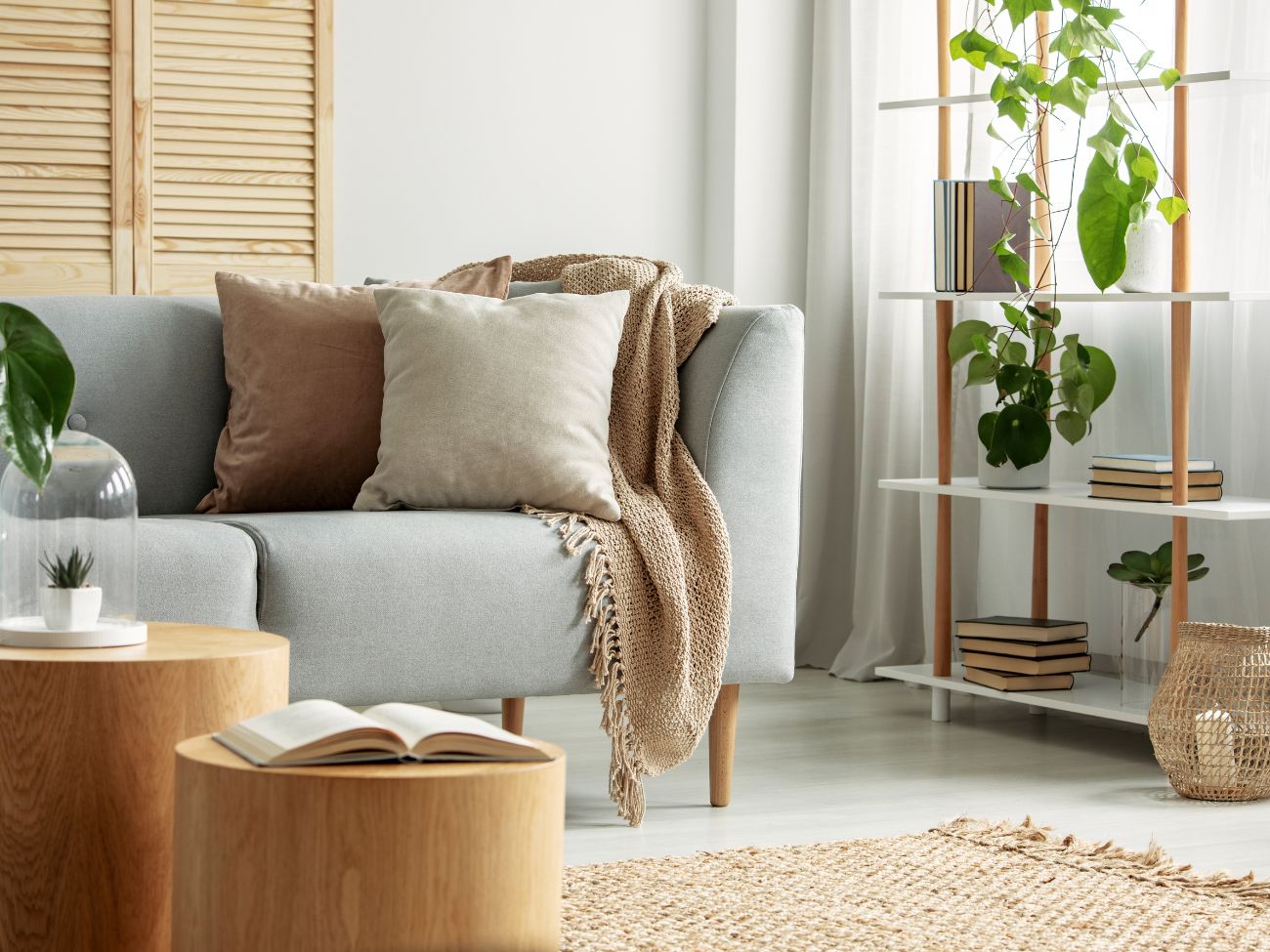
Earthy and neutral tones are some of the most versatile choices for any home. Inspired by nature—think taupe, beige, soft greys, and creamy whites—these hues work well on their own or as a base for bolder accents. They create a calming, timeless backdrop that allows for easy styling and seamless transitions between rooms.
One of the greatest advantages of an earthy palette is its ability to add depth without overwhelming a space. These tones can make a room feel warm and inviting, especially when paired with natural materials like wood, stone, and linen.
Adding depth with hybrid flooring
Flooring plays a key role in enhancing neutral palettes. Hybrid flooring, designed to mimic the beauty of natural timber, blends seamlessly with earthy tones while offering durability and visual appeal. Its warm, organic appearance adds texture and depth to your space while being resistant to wear—perfect for busy households.
To complement neutral flooring, consider adding textured elements like woven rugs, layered curtains, and upholstered furniture. These subtle additions introduce variety without disrupting the overall harmony of your home.
Warm and welcoming hues
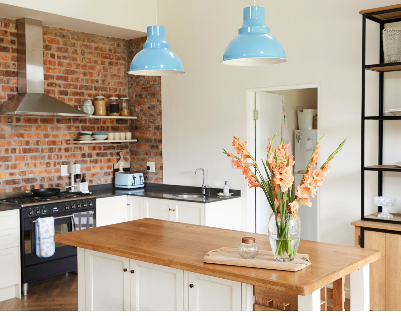
No cosy home is complete without warm and welcoming hues. Colours like soft peaches, terracotta, muted reds, and golden yellows create an inviting atmosphere, making them ideal for gathering spaces such as the living room, dining room, or kitchen.
Warm hues work well in rooms where you entertain or spend time with loved ones, as they bring energy and vibrancy into a space. However, to maintain balance, it’s best to pair them with neutral shades such as creams, beiges, or rich browns. This ensures your home feels warm and inviting without becoming overpowering.
If you love bold colours but want to avoid an overly dramatic look, consider incorporating warm hues through accents like cushions, rugs, or artwork. This allows you to enjoy the richness of these tones while maintaining a balanced aesthetic.
Bold and dynamic contrasts
Bold colours can make a striking statement when used thoughtfully. While they can sometimes feel overpowering, they create a dynamic and sophisticated look when paired with the right contrasting shades.
Dynamic contrast is all about pairing bold colours with complementary yet balanced tones. For example, navy and mustard, deep green and blush pink, or charcoal and vibrant teal all work beautifully together. Choosing colours with the same undertone (cool or warm) helps maintain a cohesive look, preventing clashing hues that may appear disjointed or chaotic.
One way to incorporate bold contrasts is through feature walls, statement furniture, or patterned textiles. These elements add a modern and expressive touch to your space while keeping the overall aesthetic intentional and refined.

Cool and calm tones
That serene, spa-like feeling you get when entering a tranquil space is often due to the use of cool and calming tones. Soft blues, gentle greens, and delicate lilacs create a peaceful environment that encourages relaxation and mindfulness.
Cool tones work particularly well in areas meant for unwinding, such as bedrooms, bathrooms, or meditation spaces. They evoke a sense of tranquility by mimicking natural landscapes like the ocean, sky, and lush greenery.
To enhance a cool-toned space, consider pairing these shades with neutral accents like crisp white linens, light wood finishes, and soft, muted greys. This combination maintains a fresh and airy aesthetic while allowing the cool colours to shine.
Creating your perfect palette
Choosing the right colours for your home is a deeply personal process. While trends can be inspiring, a timeless palette ensures your home remains stylish and functional for years. The key is to select shades that reflect your personality and make you feel comfortable in your space.
One of the best ways to test a colour palette is through swatches. Applying small paint, fabric, or flooring samples in different lighting conditions helps you visualise how the colours will interact throughout the day. This can prevent costly mistakes and ensure the final result aligns with your vision.
Be sure to choose colours that reflect your personality and uplift your space. By selecting shades that bring you joy, you’ll create a home that feels both inviting and uniquely yours.


My home is mostly white so it’s very uninspiring!
We’ve been redoing our 3 bedrooms this past winter and we’ve gone with earth tones. The results are so calming and serene! I absolutely love it! Now onto other spaces!
Excellent post with lots of information. Using colors is a major part of designing a room. Pinned! #MMBC
I wish I was a bit bolder with my choices as most of my walls are Apple white!
I’m a big lover of Teal and Baby Blue
We will be moving into new home soon and I would love to make it feel warm and welcoming and cosy. Great ideas and tips.